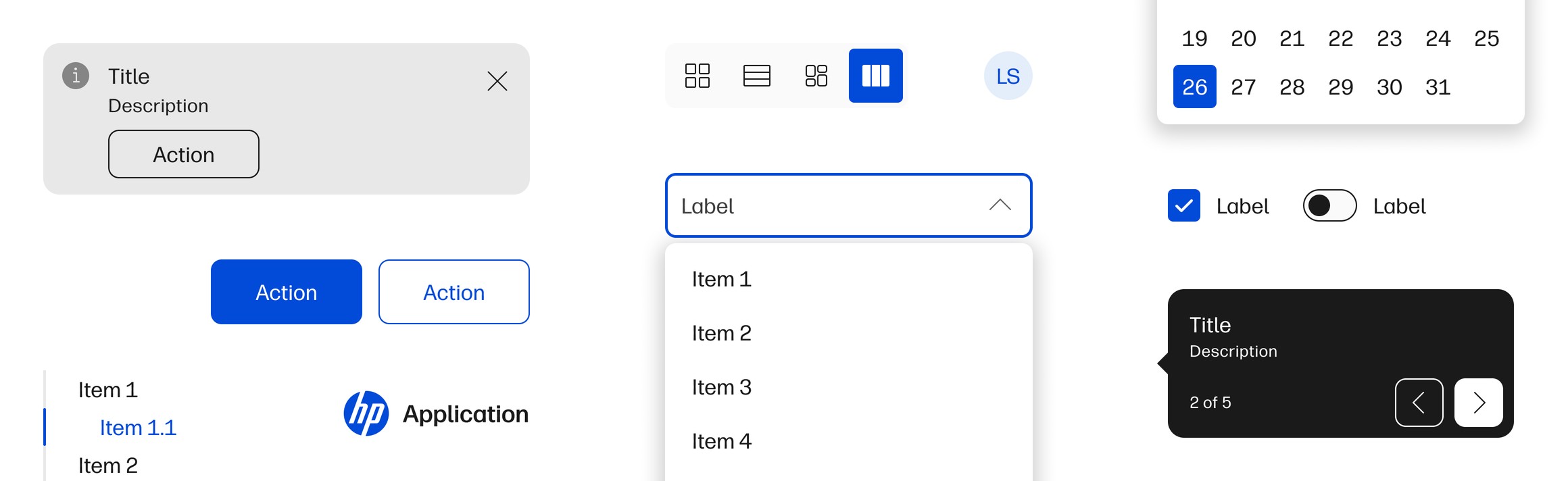
Migrating and designing components for HP's design system, and owning its library releases.
As a junior designer on the design system team, I worked directly on Veneer's component library. This was hands-on design system work: migrating components across tools, helping design new ones, and owning the library releases that put them in front of teams across HP.
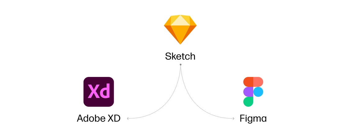
Veneer's design libraries had lived in Sketch for around five years, long enough for the system to go through two major versions before we moved off it. As part of the V2 to V3 transition we finally did, but not to a single replacement. Figma licensure wasn't universal across HP, so teams without it still needed a library they could actually use. That meant Adobe XD as well as Figma, and two independent libraries to build and keep in step with each other.
Three things were happening at once:
None of those is unusual on its own. What made it hard was that nothing was holding still.
A tool migration normally works because one thing stays fixed. The container changes and the contents don't, so you always have a correct version to check against. Here the container changed, what we were putting in it changed, and how much of it there was changed, all at the same time. There was no version of a component anyone could point at and call correct.
And every decision had to be made twice, in two tools with different capabilities and different ideas about how components should work.
Moving 50+ components across meant rebuilding them rather than directly importing them. A straight import would have carried Sketch's assumptions into tools that handle components, variants, and overrides differently, and it would have locked in a look we were actively trying to move away from. Since we were redefining the components anyway, rebuilding was the honest way to do it.
Adobe XD made that harder. Its interface and interaction model were entirely different from Figma's, so the same component often had to be constructed in a completely different way to end up behaving the same for the designer using it.
Parity was the constant pressure. Two libraries only stay usable if a designer on either one gets the same component with the same behavior, so the work wasn't finished when something existed in Figma. It was finished when it existed correctly in both software's libraries.
The migration coincided with V3, which meant every component's look and feel was being redefined for the next major version at the same time we were rebuilding them in new tools. That was a team effort across the component team rather than any one person's work. I contributed to it, designing reworked and net-new components, and took part in the design charrettes where we worked out what V3 should include and how it should look.
Working through a major version this way gave me a deep understanding of how Veneer was actually built, down to the level of individual component structure, and of what it takes to rework a design system at that scale. That knowledge is the reason I could later design documentation for it.
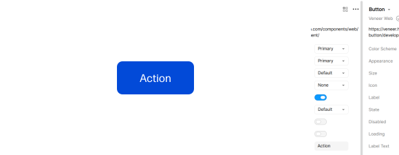
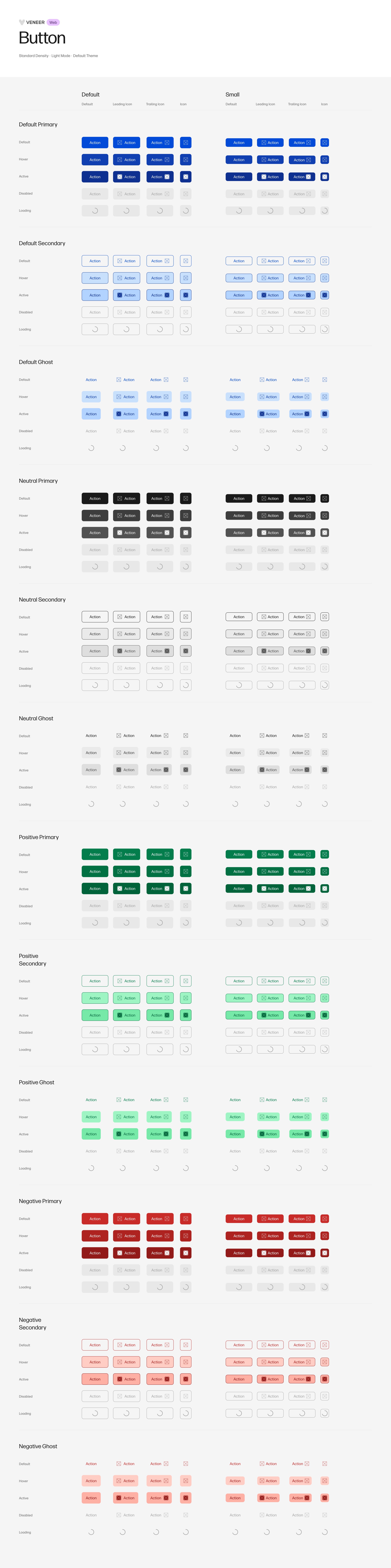
Once the libraries were more mature, I took over releases end to end, in both Figma and Adobe XD: coordinating what shipped in each release, publishing updates to both libraries, and communicating changes out to the teams consuming them.
The part that mattered most was breaking changes. Veneer's components live inside other people's files, so a change that seems small in the library can land badly downstream. It was my job to identify what would break, and to tell teams clearly and early enough that they could plan for it rather than discover it.
It also shaped how fixes got made. Where there was a way to correct a component without breaking the instances designers already had in their files, that was the way to do it, even when a cleaner rebuild would have been easier on our side. A release isn't a publish button when dozens of projects are downstream of it.
Documentation work makes more sense when you've built the thing being documented. This is the middle step of how I got to it: I'd used Veneer as a product designer on TechPulse, and here I was building it. Documenting it came next.
It also taught me to think past my own work. Owning releases meant dealing with teams across HP who depended on the library, understanding what they were building and what a change would cost them, and making decisions with those consequences in view. That's where I started learning strategy rather than just craft: not what's cleanest to build, but what's right given everyone downstream of it.
All of it laid the foundation for the documentation work that followed. Not only the best practices, but the harder parts: knowing how to structure information so someone can find what they need, and how to tell the story of a component well enough that a designer or developer understands not just what it does but when to reach for it.