Building a chart language from scratch, and becoming the team's go-to expert.
TechPulse is what HP customers used to manage large fleets of devices, sometimes thousands of machines at once. The product ran on data: device health over time, fleet-wide counts and breakdowns, alerts and anomalies. All of it had to be readable at a glance by someone scanning for problems.
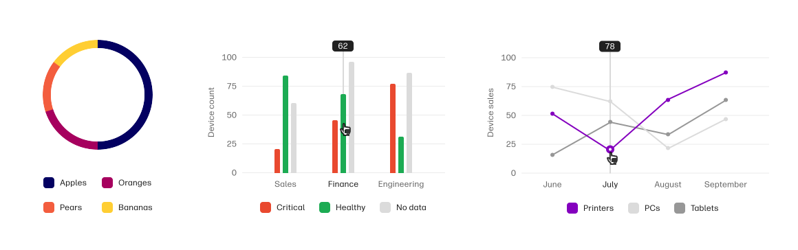
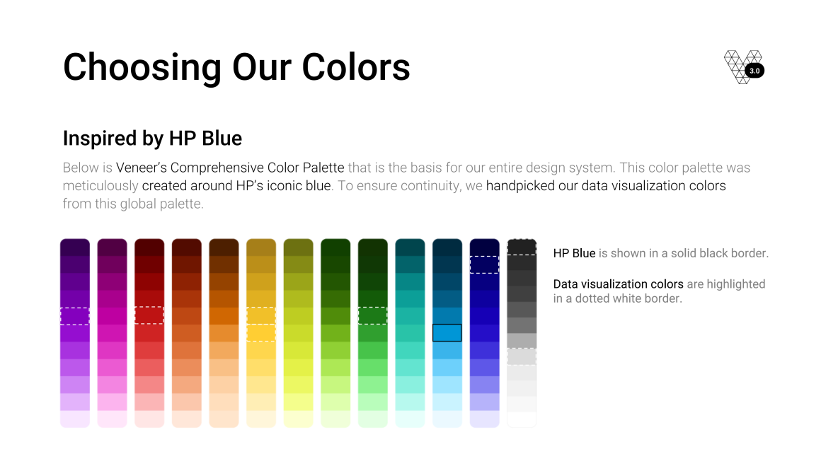
The dashboard was full of charts pulled in from Highcharts, a third-party charting library. The team had already replaced the library's default colors with shades of HP blue so the charts would sit properly inside HP's design system. That solved the brand problem and created a different one, which is what I was handed to fix.
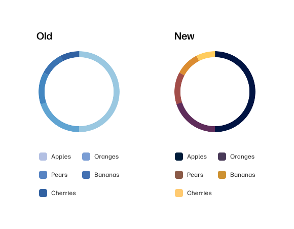
A palette built from shades of a single brand color looks unmistakably like the product it belongs to. It also gives you very little to work with when you need to tell things apart.
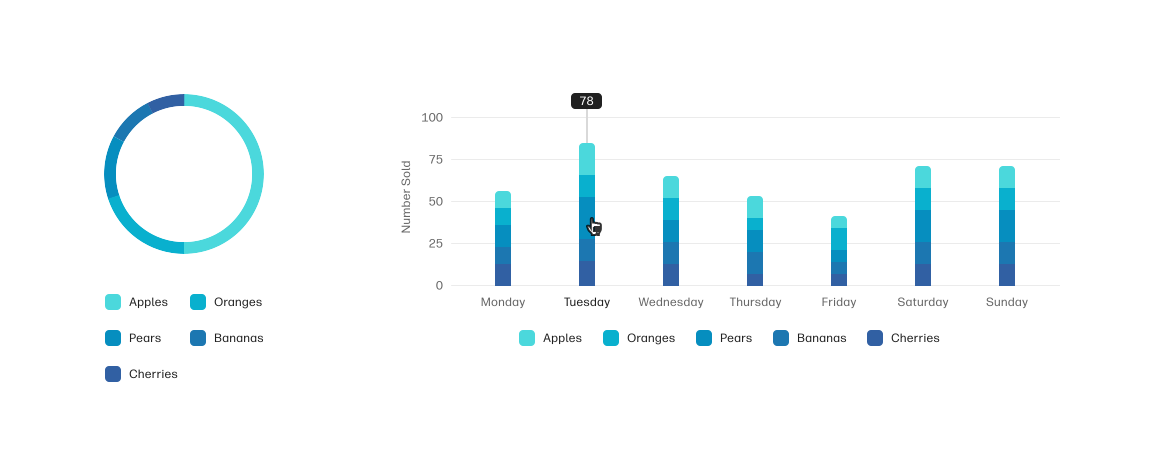
On a chart with a handful of categories, a range of blues holds up. On a fleet dashboard with many, it doesn't: the blues start landing close enough together that adjacent values read as the same color. Someone scanning for a problem has to stop and check the legend, and the chart stops being glanceable, which was the entire reason it was a chart instead of a table.

The underlying tension was that the palette had been chosen to satisfy the brand and was being asked to carry meaning. Those are different jobs. Color on a dashboard isn't decoration. It's the thing distinguishing one device category or status from another, and a monochrome range can't do that past a certain number of values.
The first decision was that one palette couldn't do it. Color was being asked to do three different jobs on the same dashboard, and collapsing them into a single set of swatches is what had caused the trouble in the first place.
So I built three, each with a defined job. The structure and the logic were mine, shaped by input from others on the team along the way:
For comparing unlike things side by side, the apples-and-oranges case. Device types, operating systems, locations. The colors carry no meaning beyond "this one is not that one," so all they have to do is stay apart.
For anything communicating health or status, where color does carry meaning: critical, high priority, low priority, healthy. These needed to read correctly and instantly, because a misread here is a misread of the fleet.
For singling out one category unmistakably, when the point of the chart is to draw attention to a particular thing rather than compare across all of them.
Separating them meant a designer picking a chart color had to answer a question first: is this distinguishing, evaluating, or highlighting? That question does most of the work.
A fixed list of categorical colors has a built-in flaw. Whatever spacing you choose is only correct for one number of categories. Pick eight well-separated colors, then use the first three, and you've got three colors sitting closer together than they needed to. That was a version of the original problem, just less severe.
So the categorical palette isn't a list. It's a calculation.
I set two fixed endpoints on the color wheel, chosen so they didn't overlap meaningfully with the positive/negative or KPI palettes. That constraint mattered as much as the colors themselves: a categorical color that lands near the status red would imply a judgment the chart isn't making.
From there, the number of categories determines the palette. The two endpoints take the first and last positions, and the colors between them are calculated at equidistant points along the wheel. Five categories produce a different set of hex values than eight, and each set is spaced as widely as that number of categories allows.
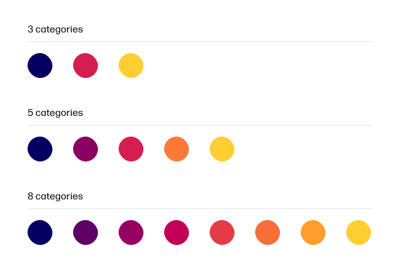
Developers implemented the calculation in code, so this ran live rather than existing as a rule people had to apply by hand. That distinction matters. A documented spec degrades every time someone is in a hurry. A function doesn't.
A designer doesn't choose colors at all. They say how many categories they have, and the system returns the most distinguishable set available.
I tested the palettes on the chart types the TechPulse dashboard actually used, rather than on swatches on a page. Colors that look distinct as squares can collapse into each other as thin pie slices or small bars, so the test had to happen in the shapes the data would really take. I also reviewed the palettes with colorblindness simulation filters, checking that the separations held up under the most common types of color vision deficiency rather than assuming they would.
Color separation is only one line of defense. Texture, patterning a series rather than only coloring it, would have added a second layer that doesn't depend on color vision at all. We didn't get the opportunity to implement it, and it's the first thing I'd add if I picked this system back up.
I presented the finished palettes and the reasoning behind them to our organization at a lunch and learn.
The guide also carried limits. The guidance I wrote is no more than six categories on a chart, and eight at the absolute most. Past that point no palette can rescue a chart. There isn't enough distinguishable space on the wheel to separate nine things, and a reader can't hold nine categories in their head while scanning a dashboard anyway. A chart that needs more categories than that is usually the wrong chart.
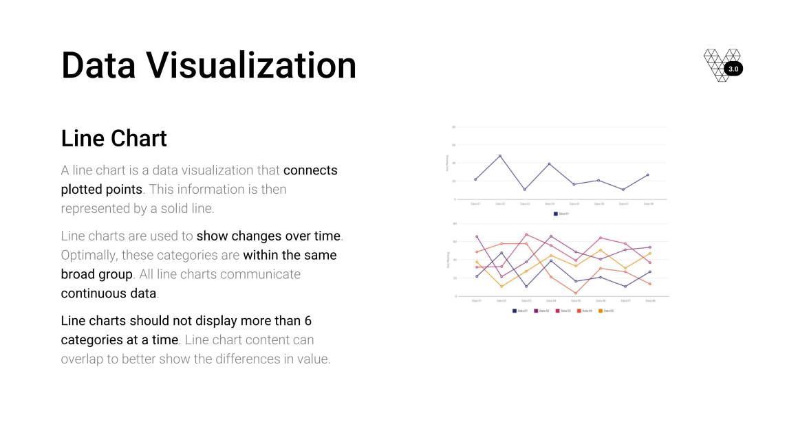
A palette only solves half the problem. The other half was designers picking the wrong chart type for the data, which no amount of color fixes.
So I wrote a chart selection guide covering a wide range of chart types: start from the question the chart needs to answer and the shape of the data, and the guide leads you to an appropriate visualization. It turned a judgment call into something repeatable.
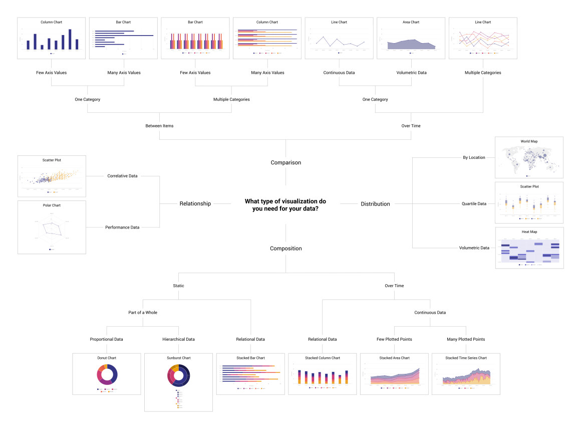
The team adopted the guide and used it when consulting with product managers on TechPulse, so chart choices in those conversations were grounded in best practices rather than in whoever had the strongest opinion. I also built a presentation on chart best practices and delivered it to the organization.
After the lunch and learn I became the design team's resource on data visualization. That meant regular UI reviews with engineers, product managers, and other product designers, working through how the patterns applied to whatever they were building. Somewhere along the way people started calling me "chart girl," which I took as evidence it had worked.
The better evidence was that other teams started using the palettes without anyone telling them to. Nothing about this was mandated. It spread because it was easier to reach for than inventing colors from scratch, which is the only way an internal standard ever really takes hold.
This happened years before I had any kind of leadership title. Building something reusable, documenting it well enough for other people to use, and becoming the person a team turns to for a specific kind of expertise is the same instinct that later shaped my work on Veneer. The scale changed. The approach didn't.
It's also where I was a consumer of Veneer rather than a builder of it. I was the designer reaching for someone else's components and looking things up in someone else's documentation, and running into the places where neither covered what my product needed. That perspective is the reason I later knew what to put in the documentation I'd go on to design.
This was the first thing I built that was meant to be used by other people rather than shipped once. The palettes were the visible part, but the rules underneath them were what made it a system. A good set of colors living in one designer's head doesn't scale, and it disappears the moment that designer moves teams. Making the categorical palette calculate itself meant nobody had to remember how the spacing worked.
That is the same lesson underneath everything I have worked on since. The artifact matters less than whether anyone else can pick it up and use it correctly.