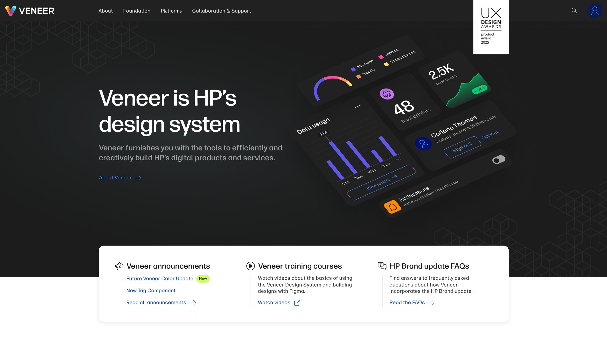
Growing a handful of pages into 80+ documentation pages, and restructuring the site to keep up.
By its third major version, Veneer had grown substantially in size and complexity, and it needed documentation that matched. There had been a site through V1 and V2, but it covered far fewer components and documented only the developer side. Designers using Veneer had nothing written for them.
That gap was obvious to me because I'd lived on both sides of it. I'd used Veneer as a product designer looking for guidance that wasn't there, then helped build its component libraries. By the time I started on the site, I knew both audiences it had to serve from the inside.
The ask was to build something exciting for the V3 launch, a site more attractive and compelling than what came before. How to get there was mine to work out: what it covered, how it was structured, how it looked, and what it needed to do for the people using it. The team also brought on a technical writer around this time, treating documentation at this size as its own discipline rather than a side effect of design work.
Over the next five years the site grew from a handful of pages into 80+ documentation pages across four platforms. It's still what HP designers and developers use today.
V3 was shipping and there was no site for it. That mattered more than it sounds, because the site is how adoption happens. Teams across HP don't adopt a design system because it exists, they adopt it because someone showed them why it was worth the switch and then made it easy to actually use. Without a site for the new version, we had no way to do either.
So the site had to accomplish two very different things at once:
Those pull in opposite directions. The first wants to be persuasive and selective, the second wants to be exhaustive. The previous site had only ever attempted the second, and only for developers.
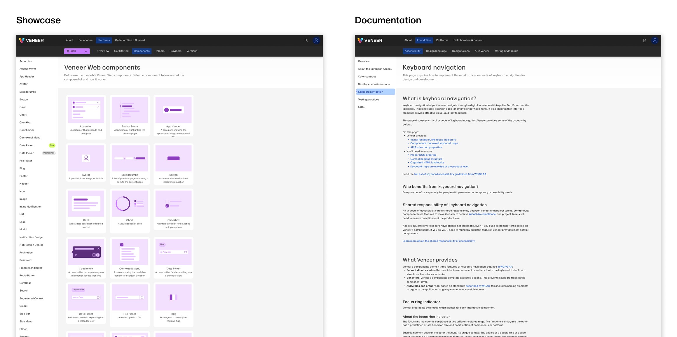
This was a team of two: me and another designer I was mentoring at the time.
The problem I spent the most time on was platforms. Veneer had been web-only through V2. V3 expanded it to four platforms: Web, Windows, iOS, and Android. Documentation that had been one page per component was now potentially four, and the same component could behave differently on each one.
The multiplication also wasn't even. Components were platform-specific, but plenty of the site wasn't. Broad design guidance, how to get started in Figma, the design language itself, applied no matter what you were building on.
And components were only part of it. We had documentation that had nothing to do with components at all, design guidance and developer guidance that existed separately for each audience. So the content didn't multiply along one axis. It multiplied along three: platform, audience, and whether it was about a component or about the system around them, with platform applying to some of that and not the rest.
That multiplication is the whole design problem. Put every platform on a single page and it becomes unreadable. Split them apart and people lose track of which version they're looking at. Organize by audience and you have to decide what happens to everything both audiences need. I looked at how other design systems handled their documentation for reference points, but our particular situation didn't map cleanly onto any of them.
I designed the structure, information architecture, and visual design, solving for designers looking for usage guidance and rationale alongside developers looking for implementation detail.
We shipped on Sanity, a CMS where developers build custom blocks that designers and writers then assemble into pages. That choice mattered as much as the design did. It meant a new documentation page no longer required a developer to build it, which is most of what made growing to 80+ pages possible. Getting those pages live was a separate matter, and one that eventually became the reason for V4.
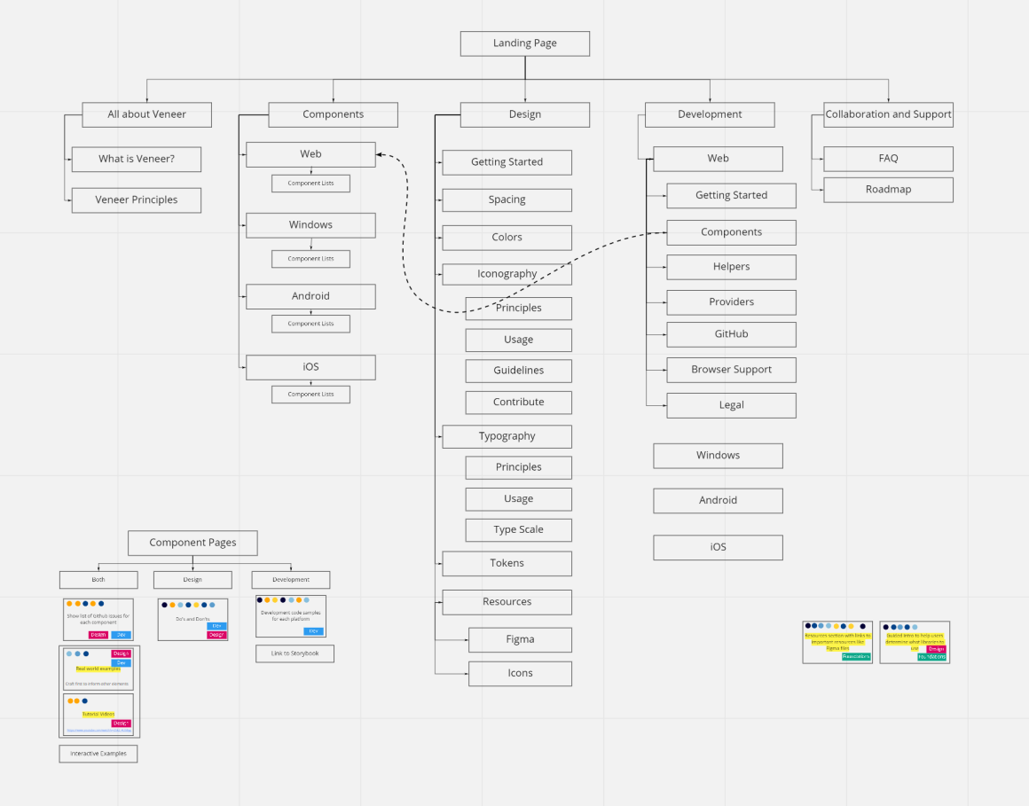
The site's original architecture organized content around role-based workflows. A user picked their discipline in the header, designer or developer, and then landed on a screen asking them to pick their platform.
As the site grew we started noticing how repetitive that felt. Whichever discipline you chose, you were met with the same platform-selection screen, so the first choice hadn't really done anything yet. Nothing was broken and nothing stopped working, it was just a worse experience than it needed to be, and users told us as much.

I led a full architecture revamp, moving the site from a role-based structure to a platform-based structure and redesigning the site within V3 to match.
That was harder than swapping the top level. By this point the site had grown well past components, and most of the top-level content wasn't platform-specific at all. Platform only mattered in particular places: components, platform-specific releases, developer documentation. A single global platform switcher would have been wrong for everything else, quietly implying a distinction that didn't exist.
The answer was nested navigation: platform scoping that appears only at the levels where platform actually changes the content, and stays out of the way everywhere else. Veneer had no pattern for this. Nothing in the system had ever needed navigation that applied to part of a hierarchy rather than all of it, so there was nothing to borrow. I designed the pattern and led its implementation.

Veneer wound back from four platforms over the course of V3, so the problem that prompted the pattern eventually went away. The pattern didn't. It's still in use for other content that applies to only part of the hierarchy, which is a better result than the one I built it for.
The result removed the redundant step and made navigation follow how people actually moved through the site rather than the order we happened to think about it in.
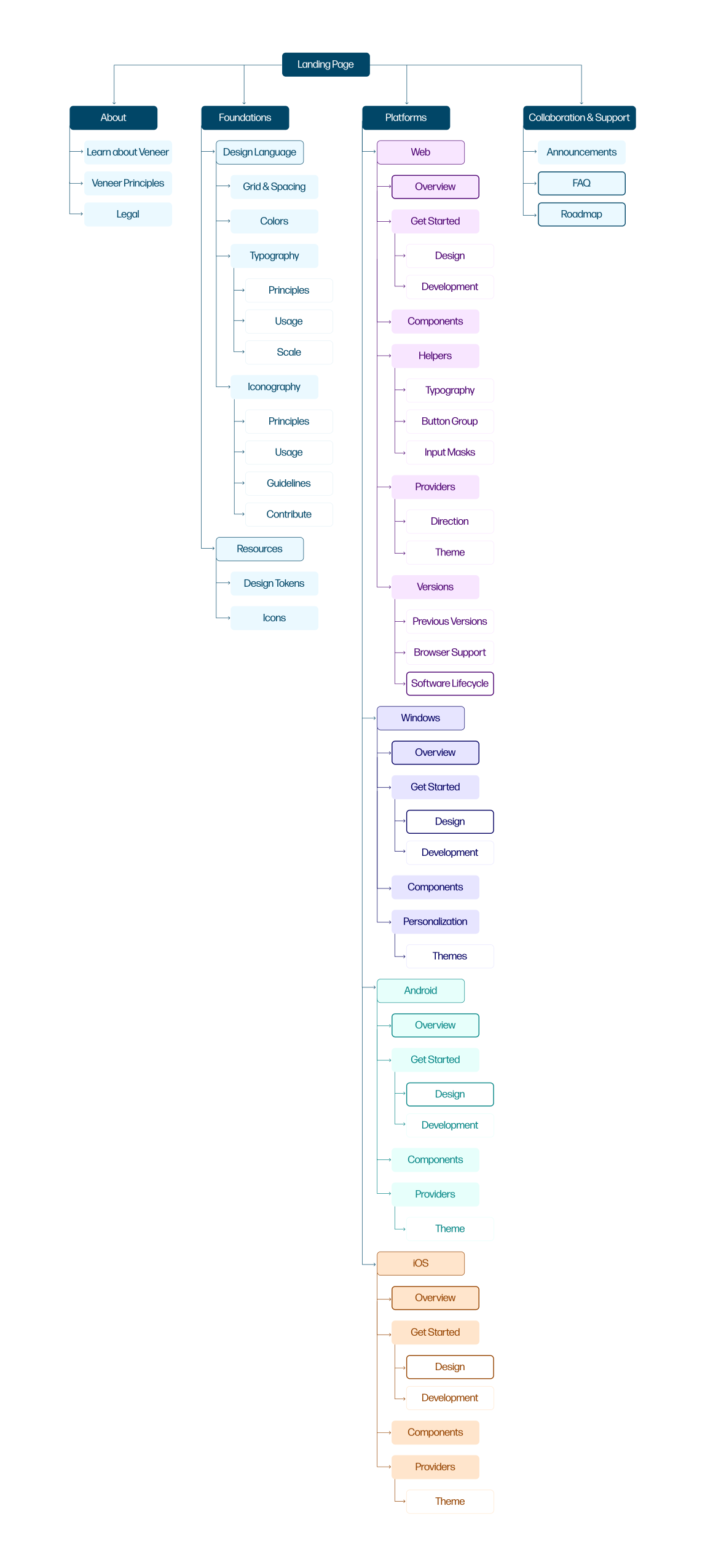
The cost of this was not small. Adopting the new architecture meant standing up an entirely new workspace in Sanity, and our existing content couldn't be carried across. Every page had to be migrated by hand into the new structure. Between the architecture redesign and the migration, the work took close to a year.
It was worth it because the site wasn't only documentation. Teams across HP were treating it as the standard for what good design at the company looked like, and adoption was climbing. A design system's own site is an argument for the system, and we couldn't hold up something subpar as the example while asking more teams to follow it.
The architecture underneath was also going to shape every page we added for years. Rebuilding a structure I had designed myself was the right call, and I'd make it again.
The bigger story of V3 wasn't the launch, it was everything after. Over its lifecycle the site grew from a handful of pages into 80+ documentation pages.
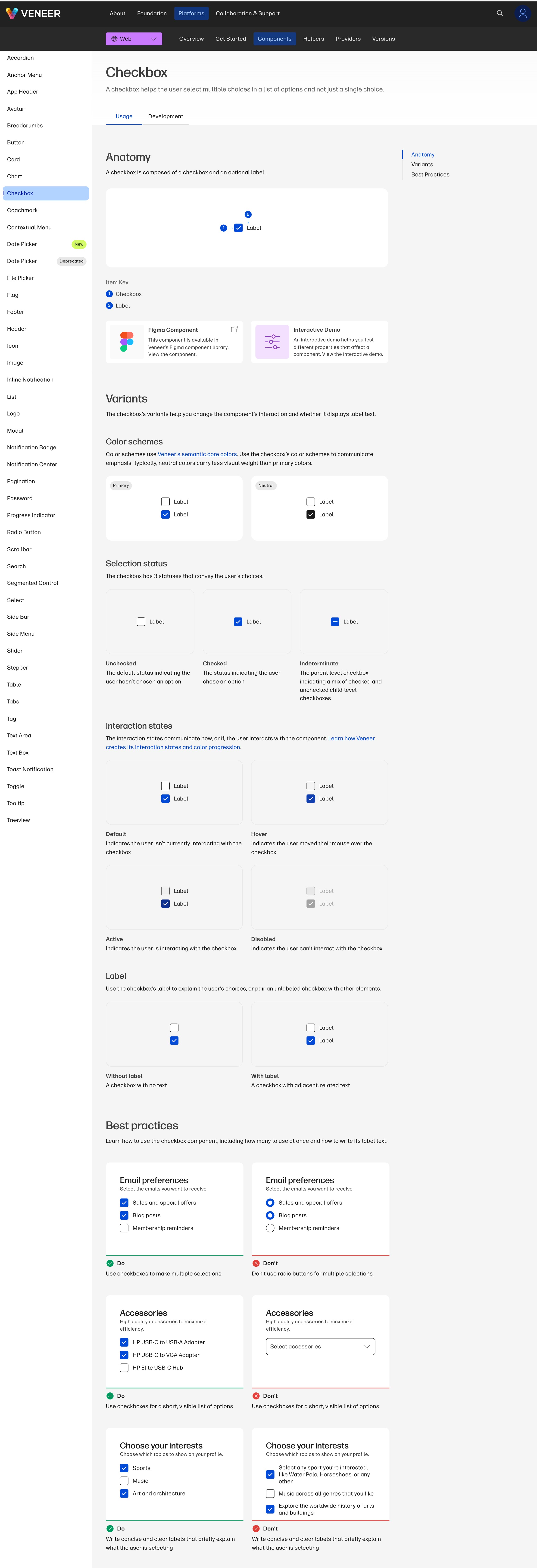
The largest project was closing the gap I'd started with: designers had nothing written for them. We wrote best practices and variant documentation, with custom visuals, for every component on web. That alone came to 54 pages of design-specific guidance where previously there had been none.
It took over a year, and it wasn't a writing project so much as an extraction one. Most of that guidance wasn't written down anywhere. It lived in the heads of the people who had built the components, in the form of decisions they'd stopped noticing they were making.
So I ran it with five other people: two subject matter experts who held that knowledge, two technical writers whose job was to keep asking why until it came out, and another designer building the visual assets alongside the text. We held a standing weekly sync and worked live in it, designing and writing in the same session rather than passing drafts back and forth.
That format is what made it work. Documentation written from a handoff tends to describe what a component is. Documentation written in the room with the person who built it captures why it works the way it does, which is the part a designer actually needs when deciding whether to use it.
From there the documentation expanded well past components:
Those were the largest efforts, not the full list. Documentation kept expanding into whatever the system needed covered. The biggest wave came in 2023, when HP went through a major rebrand. A rebrand at that scale reaches into a design system at every level, which meant substantial documentation updates across the site rather than a handful of isolated edits.
Alongside the documentation expansion, I identified gaps in what the site itself could do and drove those solutions end to end:
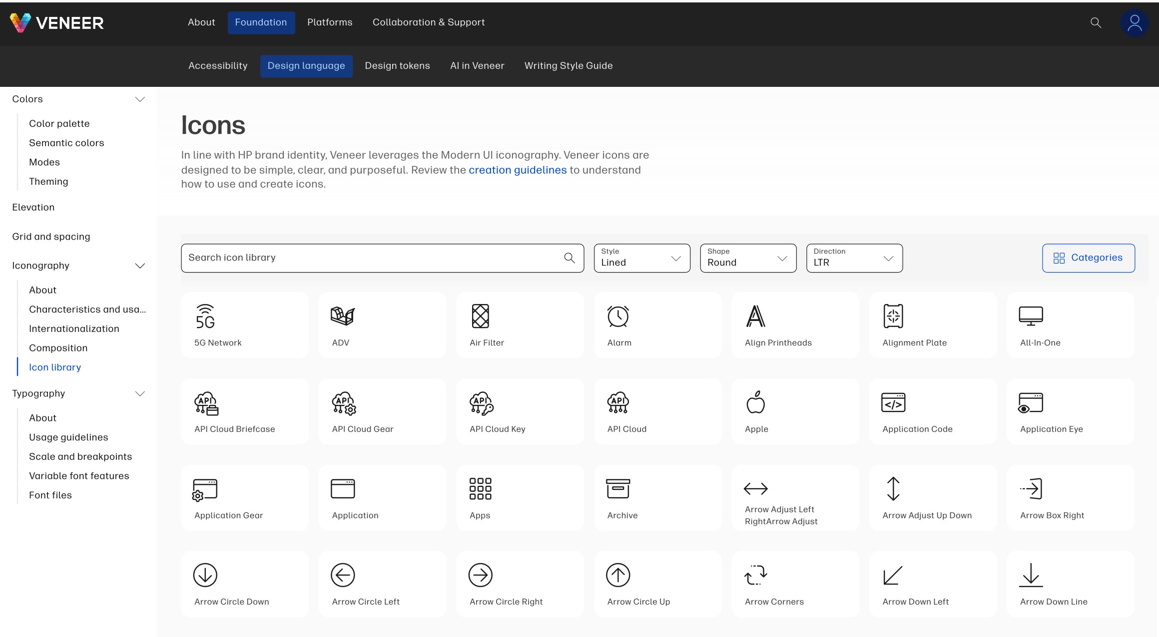
None of these were in the original scope. They came from paying attention to what people were coming to the site for and not finding, and from the questions our team kept getting asked directly. Each one took work off someone: the release notes meant teams stopped asking us what had changed, and the icon library meant they stopped asking a designer for a file. A documentation site earns its keep by answering questions before anyone has to ask them.
I spent five years on this site. That's the part I'd point to, more than any single decision inside it.
Launching something is a discrete problem with an end. Living with it is not. The architecture I shipped was reasonable and it was still wrong, and I only found that out by watching people use it for long enough to notice they were doing an extra step for no reason. Fixing it cost close to a year. The rebrand rewrote work we'd already finished. The features that mattered most weren't in any original scope.
None of that would have surfaced in a launch. It surfaced because I stayed, and because the site was mine to keep answerable to the people using it. That's the mindset I brought into V4, where the hardest decision turned out to be letting go of the custom-designed site I'd spent five years on.